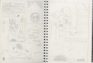
Sunday 22 January 2017

END OF MODULE EVALUATION


EVALUATION
From the outset of this module, I was unsure about my ability to use illustration to communicate experiences. Working across the 3 stages of the module, I feel my approach to research has developed from having an explicit goal, to being more about the awareness and experience of unexpected things. Throughout the module I have been exploring how experiences and narratives can be communicated through drawing and sound mapping, and then studying how narratives in the sense of Folklore are upheld in more practical traditions.  I have been encouraged by the idea of a parallel between context and function, taking the approach that my illustrations could function as educational tools about Folklore, but also promotional devices for the upkeep of these traditions.

Developing a strong awareness of my subject matter encouraged me to consider new approaches to image making. I was strongly influenced by the idea of texture and movement, with a subject matter that demanded playful and vibrant responses, I experimented with collage and handmade textures. Shape as an element I am familiar with in my practice seemed a strong starting point, however, I decided to develop this through more crafted techniques. Working with collage, I was interested to explore how my work could operate on a micro scale to that of the Morris costumes. Making collaged paper dolls, I was able to explore a fragility and craftsmanship I was new to, but apply this to shape based work that seemed to communicate the mischievousness and playfulness of the characters I had designed. Experimentation with textures and collage is discernible in my sketchbook, alongside shape based character development sketches.

For me, a success of the picture-book was the consistent application of vibrant colours and crafted collages as these seemed to maintain a playful aesthetic. The idea of telling an ‘untold story’ seemed to beg a response that was engaging and accessible to a wider audience. This pushed me to explore abstract shapes within my characters, and a rejection of human form, to create characters that were unfamiliar and therefore more universal. This approach to image making seemed to drive the tone of voice of my picture-book by achieving a sense of mischievousness and play across the illustrations. This development was informed by the study of Marcus Oakley and Rob Hodgson, both practitioners who focus on simplified shape in order to communicate strong character dynamics.

On reflection, I feel that my body of research was thorough and exhaustive, but perhaps ate into time I had to develop my visual responses. In light of this I feel I could have benefitted from having made more visual outcomes in the earlier stages of development, yet I am pleased with the outcome of my work and feel it very much requites the problems identified in my research.

The blogging process enabled me to draw more informed conclusions about the direction of my work, and I feel self-questioning was key to progress. Silent crits worked particularly well to open my eyes to alternative approaches and make sense of the direction of my narrative. I hadn’t quite captured the whole sense of the tradition, as my peers pointed out, my illustrations were disjointed and needed a visual conclusion. This drove me to consider all the characters together and in light of this, my narrative became more sequential and cohesive. Furthering my practice, a greater exploration of alternative directions could inform more developed and relevant responses. 

Studio Brief 3 - Picture-book FINAL OUTCOME


FINISHED.

REFLECTION
I'm really pleased with the outcome! The components just all seem to have worked really well together. The sensitivity to traditional Morris costumes and their textures has propelled a highly crafted approach to image making, channelling the crafting of those costumes and creating a real parallel with the subject. 

The playful characters seem to have worked really well to achieve a sense of mischief and fun without being overly personalised, in fact, they work well as being quite unfamiliar forms as this seems to make the imagery more universal perhaps. I think the fun and vibrant colour palette works just well enough to give a playful aesthetic without becoming over powering of the delicate characters

An element I would like to reflect on however, is the crafting of the final book. On a test copy I trimmed my illustrations using a guillotine, but this proved unreliable so I decided to trim all my pages by hand with a knife and rule. This achieved a much cleaner and more refined finish which I think really aids the success of the finished aesthetic. 
It was interesting making a mock-up on regular paper, and then making the final on cartridge as it was much easier to achieve a cleaner finish with the thicker paper.

In future projects I would be interested to explore printing on rolls of paper so not to require the fragmented structure. Comparing my book to published concertina books, the crisp creases and edges achieved by one long piece seem to create a very refined and sleek profile. Yet the printing constraints of this brief required the fragmented approach and I feel this was a good test of craftsmanship

Studio Brief 3 - Picture-book DIGITAL DEVELOPMENT

intended process
ASSEMBLING IMAGES ON PHOTOSHOP
I had planned originally to scan my characters and backgrounds in separately and use the selection tool to merge the layers. However, despite scanning my characters in with a block colour grounding, the selection tool was unable to pick up clean edges, and the characters looked very unrefined. Shadows were giving the characters jagged edges. Instead, I decided to scan the characters in directly on top of their backgrounds. This worked really nicely to achieve natural shadows which enhanced the 3D quality of the work
scanning characters on backdrops

PROCESS:
- scan character on relevant backdrop
- drop in to scaled image size document (including bleed margin)
- rescale/ crop image accordingly
-adjust levels and saturation
- copy levels layer across all images to ensure consistent aesthetic
- add text (shree devanagari)
-position and size to 32pt
-merge layers and save as tiff file

Dropping these images into InDesign was more difficult as I had to set up 2 different document formats. One booklet document for the double sided printing of the front and back covers, and one single sided document for the inner pages. I was able to manipulate these from the template made in the InDesign workshop, which made the process a lot easier. Having applied a bleed margin to my photoshop documents, I was able to drop my spreads straight into InDesign without any errors or issues.


FINAL STORYBOARD READY TO PRINT


Friday 20 January 2017

Studio Brief 2 - What is image making? PICTURE AREA

SEMINAR DISCUSSION POINTS

How can we place importance on certain information within the frame?
-varying sizes within the frame can alter meaning, a larger object will assert more importance than a smaller object
-larger objects may also have strongest values to give the most impact
-allowing the most important object to overlap secondary components will achieve hierarchy
-SCALE

What are the benefits of overlapping objects in your composition?
-Overlapping works to partially conceal secondary objects, enhancing the prominence of primary objects
-overlapping creates depth and distance between components
-allows more things to be fitted into the picture area
-ORGANISATION

What role does the frame play in composing visual information within your image?
-Frame can be used to crop imagery or control the space around imagery
-Cropping can allow images to be shown in their most minimal forms, communicating through the most simplified clues
-Having some components partially concealed and others fully visible enhances the interest of the image


Considering picture area and framing in light of existing work, it was interesting to see how illustrators use framing to maximise the picture area, reducing elements down to simple visual clues to allow for more cohesive and coherent images to be communicated.

TASK
-consider arrangement, overlapping, framing and cropping to create an image with 3 elements: you, an elephant and a butterfly.


I had considered the idea of an elephant having a wash and through roughs and sketches, this seemed to make the best use of the frame as only a large leg was required to demonstrate the size between the figure and the elephant. Having the character looking up from a low vantage point enhanced the scale of the elephant and seemed to compliment the narrative. I found it more difficult to incorporate the butterfly as I was fighting with scale and depth: how small should a butterfly be next to an elephant? vs. how big would it be if the elephant was in the mid-ground? While I'm not convinced the scale of the butterfly works effectively, I feel the cropping and positioning allows it to make use of the negative space and give focus to the elephants trunk.


Thursday 19 January 2017

Studio Brief 3 - Picture-book DEVELOPMENT OF FINAL PAPER CHARACTERS


PAPER MORRIS DOLLS
Following the process used in my experimentation, I have used templates from my drawings to create hand-cut paper dolls of each character. Applying more subtle textures in the form of watercolour washes, with my textural crayon details, these characters have achieved so much personality and playfulness through careful consideration of media. 

Working on a rather small scale, the figures really capture the fragility of the media and the textural qualities sensitive to the subject matter. I'm really pleased with the outcomes as I have been able to maintain the aesthetic of my character sketches but within a much more crafted approach that compliments my intentions.

The use of block colour works really effectively to break up textural areas and bring prominence to details, and this has worked well in unison with reduced colour palettes to really identify each team and tradition honestly.  


BACKGROUNDS
In line with the watercolour textures and colour palettes applied to the characters, I have made watercolour background washes for each character, applying a contrasting or complimentary colour to maintain the vibrant palette of my book. This will be scanned in along with the characters and vibrancy and levels altered on Photoshop where necessary to control the values of each illustration.


Wednesday 18 January 2017

Studio Brief 3 - Picture-book COLLAGE EXPERIMENTATION


Following a similar process to that applied to my style guides, I've used my sketchbook to test collaging with my made textures, exploring overlay of block colour against pattern and texture to achieve variation in values. A mix of textures seems to work well to allow all components to sing, but I've found that block colours work really effective to provide a grounding to key information

Testing the application of collage to my characters, I created templates from photocopied drawings and used these as a guide to create textural pieces. This process has worked well to enable me to accurately replicate the characters that I have spent so long refining. It could be easy to lose the form of the characters with small errors in cutting so these templates have enabled me to achieve an element of consistency in my work. 


This test piece made in my sketchbook has worked really well using texture to identify different components of the costume. I do feel however, that the waistcoat could be more subtle so not to detract from the rest of the character.  Working to 2 main colours has enabled me to characterise the character through his costume, something which will be important across the wider body of illustrations to distinguish between Morris traditions. 

REFLECTION
Having experimented with digital and analogue approaches to collage, it seems that analogue collage achieves a lovely crafted quality, something I feel is really key to the tone of voice of my illustrations. My main aim is to capture the playfulness and tactility of Morris costumes, and while the digital process achieves this in a quick and reliable process, the final aesthetic does not seem to fully echo the personality of these characters


Studio Brief 3 - Picture-book DIGITAL COLLAGE EXPERIMENTATION


PHOTOSHOP COLLAGE
With the given constraint of having to print my picture-book in a digital format, I have decided to test a digital approach to collage in order to create images that I can manipulate more easily within the digital format. Using the drafted spreads drawn out in my sketchbook, I scanned these drawings in and used them as outlines in which to drop-in textures. 

Using the selection tool, I was able to highlight multiple selections at once, dropping in textures to several areas. This proved to be a very efficient method of collaging. However, I feel that the clean, uniformity of the digital aesthetic does not seem to fully achieve the crafted aesthetic I had intended.  It may be that erasing the black outlines would achieve a more accurate mimic of analogue collage but I will need to test the qualities of analogue collage before I pursue this approach.
The ability to apply one texture to several components at once seems to achieve a consistent aesthetic with the textures being applied in one direction across the images. This works well to enhance the simplification of colour and shape, but I will experiment with a more playful textures through variation in texture quality. 

NEXT I MUST TRY ANALOGUE COLLAGE AND COMPARE VALUES

Studio Brief 3 - Picture-book MAKING COLLAGE TEXTURES

TEXTURE TO ACHIEVE IDENTITY
A key element I identified in my research was the role of textures and colour in Morris costumes. These seemed to be the defining elements of the different teams and traditions so this identity will be pivotal in my picturebook.

Having already explored collage with crayon textures in my early style guide experiments, I felt the grain quality achieved by crayon, achieved a lovely natural looking textures, echoing the connection Morris dancers have with nature and nature folklore, and also appeared rather playful. It was suggested in my tutorial however, that block colours may be needed to aid the balance of the images and strengthen the aesthetic. 

In line with my initial tests and feedback received, I have experimented with markers, crayon, watercolour and cut paper to create a body of marks that correlate to the relevant colours of each character and scheme. 


I have considered pattern but limited myself to single colours so that the pattern becomes more of a tonal, textural feature rather than a bold distraction. 

I may find that some of my characters require loose pencil marks on top of collaged shapes to achieve more textures, but this can be identified in further experimentation. My plan now is to apply these textures to analogue and digital collage experiments to explore the different aesthetics and qualities that these give to the tone of voice of my images.

At this stage I feel analogue collage will work well to achieve the crafting demonstrated in the Morris costumes, however, digital collages may be quicker to produce and be easier to manipulate for digital print

Studio Brief 3 - Picture-book PLANNING FINAL SPREADS


RESPONDING TO FEEDBACK
Following on from suggestions made in the silent crit about the composition and conclusion of my work, I have planned the final spreads of each image. The main alterations were the use of all 5 characters in a final conclusive image, and the addition of a cloth in the hand of the Cotswold dancer to make better use of the negative space. 

Working to scale, I have drafted these considering framing, line and narrative. When I experiment with Photoshop, I will hopefully be able to explore the positioning of text as a compositional device, which should hopefully enhance the aesthetic further. 

NEXT
I will now explore the application of media to these characters and backgrounds, considering different approaches to collage as a means to captures the texture and tactility of Morris costumes.

Tuesday 17 January 2017

Studio Brief 3 - Picture-book PEER FEEDBACK

SILENT CRIT
Displaying all the work I have up to this point, my peers evaluated my work and discussed potential areas for development. 

Points raised:
- Reduced colours are successful
- The 'I saw this' voice really embodies the meaning of folklore
- Could be good to really over emphasize the humorous elements on the characters.
- The horse in the mock-up needs to be given some context of not included
- Maybe use the whole length to show a linear image, dancers across the country
- Maybe punctuate characters with crazy animal heads
- Work to a limited colour palette of primary and secondary
- Mix textures with block colour

THOUGHTS & REFLECTIONS
I am interested to further explore a linear connection across the pages, but my intentions to inform the reader about the 5 Morris traditions remain the same. Perhaps I could achieve a more unified image at the end, in place of the horse, to show the dancers together, this could include a narrative about the folk festivals they meet at.

The idea of mixing block colour with texture is also interesting as I feel this will aid the strength of my visual clues, perhaps using block colour to enhance the most defining features of each character. 

While my peers praised the tone of voice used in my initial zine, I'm not convinced an 'I saw this' narrative will transfer to the new subject matter. While the tone of voice does embody the very nature of folklore as hearsay, my subject matter has now become more solid and factual, perhaps requiring a more direct narrative. For this I intend to employ short quotes from my transcripts to reveal characteristics of each Morris tradition. 

I agree with the issue of the horse image. My research into Morris dancing has shown the horse to be key to many groups and dances, but I understand that the horse is not necessarily suited to the wider context of the book. I may replace this spread with a more conclusive image of the Morris Men together, displaying their unique qualities in one image. 


Responses to crit in sketchbook


PLAN
Moving on, I now need to refine my characters in line with the feedback received, and make the textures and cut shapes to build these. I will need to go back to my sketchbook to re-plan the final spreads, but hopefully I should be able to formulate a scene from the full figure drawings. 

Studio Brief 3 - Picture-book MOCK-UP


SKETCHBOOK PLANNING
In preparation for making a mock-up I made a refined version of my story board, applying my character development work and taking greater consideration of composition and structure. I have aimed to alter between closely cropped and wider framed images to achieve a more structures aesthetic. 


TESTING THE PROCESS
Having chosen to work with full bleed images, and work across the spine, I've decided to work with concertina as I feel this method is the most suitable for the mechanics of the narrative and imagery. Working from my initial storyboard and more recent character development, the mock-up shows a slightly altered visual direction, taking a more exaggerated approach to the aesthetics of my characters. While I have not yet concluded finally on the content of each spread, this should provide a good base for feed back in my peer review session.

I've drawn up the mock-up in simple black ink, just to illustrate the premise and layout, but I will be working on the media development of these images this week.


An issue I have identified is in the flow of the composition. I have a few spreads that are very closely cropped, while others are more wide-set picture frames. I think in the final layout I will make sure to alternate these to ensure the composition and aesthetic as a whole is varied and not fragmented. 

Studio Brief 3 - Picture-book FURTHER CHARACTER DEVELOPMENT


Finally getting somewhere...

EXHAUSTIVE SKETCHBOOKING
Further to my design sheets, I have worked exhaustively in my sketchbook to create characters that achieve the mischief and fun of Morris dancing. Responding to each of the 5 Morris traditions, I've created a range of characters which could be applied and adapted depending on the composition I choose to apply to each spread

The sketchbooking process has proved really useful to me at this stage as I have been quite slow with visual responses and development, and this has forced me to repeatedly draw the same characters and shapes to generate a large body of possibilities. I feel that this exhaustive approach to character design has enabled me to produce a wealth of variations which each capture a different tone of voice and hopefully can be developed in appropriate media to channel the Morris traditions. 


Through abstract forms and comical shape I have attempted to foster some traits of Marcus Oakley's work, channelling a playful aesthetic suitable to the subject matter. It will be interesting to see how my peers respond to these in the silent crit. I may need to alter some characters slightly to correspond with changes in layout and composition. At the moment it seems that some characters, with the nature of their costumes, are better suited to being closely cropped, while others need the full figure to fully communicate. 


Monday 16 January 2017

Studio Brief 3 - Picture-book CHARACTER DEVELOPMENT


RESPONDING TO FEEDBACK
Considering the discussions that took place in my tutorial, I have started to explore character design in light of the comical and mischievous feel we identified in conversation over my research. Exploring shape and line as a means to achieve humour and character is something evident in the work of Marcus Oakley and Rob Hodgson, and so I have studied their practice to inform my practical development. (See separate blog posts) Exaggerated and surreal body shapes have achieved a playful aesthetic so far in my sketches, something I could perhaps enhance even further to really achieve strong comical imagery . 


While these drawings have been done in simple pen, china-graph and pencil, I will need to explore media when I come to developing these. Perhaps I will work towards a refined shape for each character and then start to consider the relevant texture and colours for each one.

Studio Brief 3 - Picture-book TUTORIAL


WHAT PROGRESS CAN I MAKE?
The main point of discussion from my tutorial with Matt was the playfulness of my imagery. While my media tests showed simplified characters and busy layering, Matt suggested playing around with shape and gesture more to create more humorous characters to connect with the fun subject. Having seen my character work across the modules, Matt identified that my characters are often quite mischievous, which I hadn't identified myself, but does seem true, and that idea of cheeky and mischievous is something I want to bring through into my Morris book

To progress this I will work through more design sheets and in my sketchbook to explore more abstract body shapes and facial features to really exaggerate the humour of these characters. Comedy eyebrows and ears seem fitting somehow...

Additionally, we discussed simplifying my images down even further. 
How little information is needed to communicate the whole?
Reducing  my images down to more closely cropped, minimal shapes could create a more direct aesthetic that communicates in as just a coherent way. Colour play may aid this by enhancing shapes and pages to allow simpler images to really sing. 

WHAT NEXT?
Responding to the given feedback I will go back to my sketchbook to fully exhaust possibilities for humorous characters and start to play with media as a means of exploring colour schemes and shape. 

Sunday 15 January 2017

Artist Research - ROB HODGSON

ROB HODGSON - CHARACTER DESIGN 
Rob Hodgson achieves a real sense of play and humour in his work through experimentation with shape and texture. Hodgson's rather blocky shapes seem to achieve a sort of carefree quality, almost as if Hodgson is able to manufacture a character out of any irregular shape or off-cut. I am interested in this idea of unconventional imagery.  
 
- What are the defining shapes and lines needed to communicate a figure? 
-How little visual clues are required to understand a character? 

To explore this approach in my own work, I hope to experiment with cut paper, exploring how the knife can change and characterize the shapes organically.

Texture is key to Hodgson's work and his application of texture seems to be the driving force in his tone of voice. Handmade marks and patterns offer a sensitivity suited to Hodgson's characters, enhancing their playfulness and issuing further personality dynamics. In light of my own practice, I have been exploring collage through handmade pencil textures, but working with paint and block colour could also be effective in achieving more solid shapes and more direct visual clues. Scanning in made textures and applying these to digital shapes could be a way to achieve cleaner illustrations, but I am more concerned with the crafted aesthetic of paper collage as I feel this echos the crafted costumes of the Morris dancers.

Artist Research - MARCUS OAKLEY

MARCUS OAKLEY - CHARACTER DESIGN

The charming illustrations of Marcus Oakley capture such a great sense of fun and play, using exaggerated,  unrealistic forms to communicate comical characters. Oakley's use of bright, block colours works to enhance the playful aesthetic in his work, exploring cut shapes with block colour to achieve an immediacy crucial to the success of the work. Oakley's work with black and white also achieves a strong aesthetic through consideration of texture, working with line and marks to add value to the shapes

I am particularly concerned with the way Oakley explores rather exaggerated and free shapes, perhaps something I could echo in my collage work, allowing the knife to work more fluidly towards organic shapes. Unrealistic and irregular body shapes seem to achieve a real sense of humour and mischief, creating a playful and juvenile tone of voice. 

Having started to explore character design as a means to communicate the traditions of Morris dancing, I may look to channel some of Oakley's approaches to image making, through shape and form, in order to create simplified interpretations of characters that could engage a more universal audience.

Studio Brief 3 - Picture-book MEDIA EXPERIMENTATION

TESTING
Working from source images from Arcadia Britanica, I have explored collage as a starting point for developing my visual responses. Creating textures with china-graph and colour pencil, I have made some rather playful, free marks to achieve an energetic and playful aesthetic. Collaging from these has enabled me to layer up my own textures and marks, issuing shape qualities with the direction of the knife. Attempting to work within a reduced colour palette, I'm not sure how well the textures stand up against one another, but this is an element I could refine.
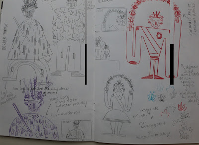
My ideas have been to create images that capture a character from each tradition, focusing on that tradition's unique qualities to create the image. A consideration of composition will be key to the development of this, in order to ensure the focus remains on the unique characteristic of each tradition. 


REFLECTION
To work towards some more refined and developed images, I may explore the use of cut paper, adding block colour to enhance the value and strength of the collaged components. This may work through adding texture to coloured paper, or alternating coloured paper with handmade textures to explore a busy and playful aesthetic. While the hand-type has worked to explore a narrative, I will need to explore digital type in order to achieve text that is complimentary, yet subtle alongside the imagery. 


Saturday 14 January 2017

Studio Brief 3 - Picture-book INITIAL STORYBOARD

STORYBOARD: WHY I'VE DECIDED TO MAKE ONE NOW...
While I'm not yet at the stage of having developed images to start to collate, I feel that the different elements of my narrative, the Morris traditions, require a concise and cohesive narrative so I have formulated a storyboard as a driving force towards more developed images.

Considering the information gathered in studio brief 2, I am intending to explore a narrative that communicates simple quotes or facts about each tradition, to give an overview of Morris culture and serve as a snapshot into the practice. So far I have achieved this by using key visual devices to reveal each tradition, and accompany this with a quote from my dialogues. This may be something to review after my tutorial and having gained feedback from peers.


REFLECTION
I'm feeling a bit behind at the moment as I had to wait quite a long while to visit the Morris practice, so am only just starting to visualise my ideas. This storyboard should hopefully set me on my way with some more visual directions and my development process should pick up soon. To commence the image making, I intend to explore collage as a means of echoing the textural nature of the Morris costumes, a media which should hopefully enable me to exhaust experimentation and play

Friday 13 January 2017

Studio Brief 3 - Picture-book PROCESSING RESEARCH

UNPICKING KEY DETAILS
Commencing the next part of the journey, I've started to respond to my research and initial observations, creating fact files for the 5 Morris traditions, and drawing stereotypical interpretations of their tradition. 

This process has allowed me to unpick the information collected in my dialogues, and visits, and start to visualise the Morris culture as a whole. Taking key quotes and facts from the conversations I had, I have formulated a brief summary of each tradition, in order to drive my visual development


Mapping out potential colour palettes and key visual devises, I aim to develop my visual responses through exploration of textures and collage, taking a playful approach to image making to echo the playful nature of the subject matter. Formulating these codes for each tradition should enable me to exhaust visual interpretations, whilst maintaining the necessary clues to communicate each group. 

INTENTIONS
Starting to realise my ideas, through collating my research into visual fact-files, I now have a more coherent idea of the direction of my book and the components I wish to develop. Moving on, I will look at structuring an initial storyboard to act as a guide for the initial images I need to create. With this in mind, I will need to be exhaustive in my sketchbook with character design and simplification of character, aiming to create images that are clear but playful and humorous, achieving a tone of voice relevant to the Morris culture. 

Tuesday 10 January 2017

Studio Brief 2 - What is image making? 3 ELEMENTS CHALLENGE


Following on from the initial discussions around compositional elements, we were set the task of creating a composition that incorporates 3 given elements. It was interesting to work to given constraints as this offered the chance to work in a similar way to an editorial context, working to the constraints given by an art director. Working with these three components seemed rather challenging as I feel it is easy to give yourself briefs that are easy to achieve, selecting complimentary components for example. So the 3 elements challenge has really worked to encourage me to explore how composition can insert meaning and aid the coherence of an image

-S U B M A R I N E
-M A N   I N   S U I T
-T E N N I S   R A C K E T


I attempted to formulate as many scenarios as possible from the 3 components, aiming to draw less-conventional scenes from the subjects. I quite liked the roughs I made for the diving scene as this seemed to incorporate all 3 elements in a way that seemed to make sense, perhaps the elements were in a believable context. However, I felt that the elements of composition, particularly picture area and line of sight, begged a more interesting image. Working within a tighter frame and closer cropping I used one leg to capture the subject of the man and this allowed me to make better use of the picture area, using overlapping to create a sense of hierarchy and depth. 

I am quite pleased with the outcome as I feel the framing allows the image to nod to each component without them all fighting to be seen in full. I would say however, that value needs to be more considered in future work as there is not much variation. 

Sunday 8 January 2017

Studio Brief 2 - What is image making? WHAT IS COMPOSITION?

SEMINAR DISCUSSION POINTS

What is composition?
-The arrangement of appropriate elements, across the whole space, not just that which is occupied
-Considering how space and scale alters the meaning or message of an image

What can good composition achieve?
-Achieves a balanced and harmonious image
-Framing, selection and arangement work towards a harmonious whole
-Leads the eye directly or indirectly

What are the four main elements of composition?
-AREA - picture area, boundaries, perimeters, frames and real estate
-DEPTH - perspective, illusion of distance
-LINE - direction our eye follows or line we direct the viewer on
-VALUE - lightness or darkness, tone of voice, colour values

It is important to consider compositional elements and start with these in roughs, sketching multiple solutions allows different compositional approaches to be tested. 

Consider how the image will be read and the arrangement of visual information. What is key and what is contextual? 


Studying examples of composition in context, the role and impact of composition started to become clear. Using roughs to document illustrations, we deconstructed these, considering line of sight, variations in values, depth and picture area. I found it particularly interesting to consider picture area in light of the rule of thirds as many illustrators seemed to work with this convention either at an extreme or rather subtly. Having key details occupying a small fraction of one third seemed to create an enormous weight in the other thirds, only fairly enhancing the tone of voice of the image. Line of sight was also key in many images to ensure the eye took in all components but always resolved to the most important component. 

I am interested to consider the role of composition in editorial work as this was something I found challenging in the visual skills module, and I feel this formula for image making could clarify some approaches that would benefit an editorial brief. 
 

Friday 6 January 2017

Studio Brief 2 - Visual Journalist MORRIS PRACTICE RESEARCH VISIT

VISIT TO LEEDS MORRIS MEN DANCE PRACTICE
Having started to pursue the theme of Morris Dancing I have already met up with a Morris dancer to interview him about Morris traditions and cultures, but this left me curious about the actual dances and the dancers themselves. To answer more of my questions I organised to visit the dancer in practice, with his team, the Leeds Morris Men.

So far I have learnt about the different traditions in Morris, and the differences and qualities that define them from one another. From the outset, I had assumed Morris dancers were all doing the same thing but in indifferent costumes, so visiting a practice was a perfect opportunity to understand more about specific traditions. 


Documenting through photography, video recording, observational drawings and collected ephemera, I have sourced some new research and material on which to progress my work. 


As a Yorkshire team who follow Cotswold Morris traditions, the side danced with handkerchiefs and wooden sticks, with bells on. All components that I could use to visually communicate their specific traditions

INTENTIONS
My intentions at this stage are to create a book that communicates the wealth of traditions across Morris folk culture, and the qualities that define these. Costume particularly being important to the aesthetic of each group, I carried out some observational drawings of the Fool of the team.


Considering the audio dynamic of Morris dancing, I made some sound maps to document the sensory experience created my these dances. Creating marks and textures that could be re-appropriated as collage textures to develop the visual aspect of my work. 

On my visit I was shown a photo-book, documenting The Dales Tour, an annual Morris dancing tour where several different teams from various traditions gather to celebrate the folk culture. It could be interesting to explore this idea of community and the variety of traditions together within my picture-book, perhaps as a last page to summarise the culture. 


Following on from this research, I intend now to study the 4 other Morris traditions discussed in my last transcript, and draw from reference images as a means of formulating a base for development.