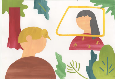
PROGRESSION WITH MEDIA
In line with the media tests I have been carrying out in my sketchbook, I have carried forward with the use of gouache and cut-paper, now using gouache to create textures from which I can cut basic shapes. Working from made-textures has encouraged me to really focus in on a reduced palette of complimentary tones, revolving around the iconic yellow of Miss Shepherd's van. I did have some difficulties working on a slightly smaller scale for the postcards than I had been working in my sketchbook but I solved this by creating templates from my roughs in order to maintain the intended aesthetic and shapes.
CHINAGRAPH POSITIVES
Following on from the experimentation with overlays, I have created the textural details and smaller pieces of information on layers of true grain, almost as if creating positives for screen print. Having been looking at the work of Stephanie Wunderlich, I wanted to try and channel her use of overlays and so I have created these drawn layers to overlay the cut paper in photoshop. Working with chinagraph on true grain has achieved a really lovely line quality, capturing textures complimentary to the natural imagery and maintaining the grainy pencil aesthetic explored in my development work.
Developing the images on photoshop, I have scanned in the cut paper layers and the chinagraph positives and overplayed these to achieve mock-screenprint outcomes. Using the selection tool, I was able to select the black lines and fill these with the relevant colours to add textural information to the cut paper shapes. Working with layers in this way meant that I was also able to change blending modes and achieve some overlay effects between tones, further exploring screen-print qualities.


No comments:
Post a Comment