Thursday, 28 December 2017
Study Task 6 - Presentation
JONNY HANNAH
- Edition and dimensions number stated
- Format, media and number of colours are stated and process where applicable
- Online shops offer unframed but exhibition prints are available both framed and unframed
- Short narrative accompanies product description online
- Prints are signed and stamped by illustrators own press logo
TOM FROST
- Prints are displayed on website mounted, framed and hung in context
- Paper stock, weight and paper size stated
- Prints are posted in cardboard tubes or card backed envelopes
- Process and context of work stated on YSP
- Edition given
- Framed prints unavailable online
Friday, 1 December 2017
Study Task 5 - Sound Study
SOUND DECONSTRUCTION
G-AAAH from Lizzy Hobbs on Vimeo.
'G-AAAH' by ELIZABETH HOBBS
- sound effects are consistent with content/ aesthetic/ medium
- visual and audio tempo are synchronised
- mechanical/ analogue sound effects used alongside analogue aesthetic
- colour backdrops seem to work in partnership with changing rhythm, image and pace
- slight jitter to frames echoes analogue film, appropriate to the analogue assets used
- typewriter becomes instrumental audibly as well as visually in creating images
THE PROCESS from SALMAN SAJUN STUDIO on Vimeo.
'THE PROCESS' by SALMAN SAJUN
- dynamic sound effects directly echo the actions on screen
- pace and tone of sound directly correlates with visual content
- audio qualities create a fluidity that aids transition of visual elements
- mechanical/ physical sounds characterise the visual process described through a crafted tone of voice
STORYBOARD SOUNDS
(0-15 SECONDS)
Wednesday, 22 November 2017
Study Task 4 - Animated Shorts
DU IZ TAK? - CARSON ELLIS
-build up of layers makes simple movements appear more complex on stationery backdrops
-oppacity used to transition between scenes
-audio is sensitive and synchronised to visual content and tone of voice
POPULAIRE - ALEXANDRE COURTES
-overlays maximise colour palette and simple simultaneous movements
-echoes a CMYK separation aesthetic
-staggered entry of assets creates continuous movement from stationary elements
ISIDRO FERRER
-fluid movements enhance pace and motion
-simplified forms make transformations appear complex
-considered use of anchor points create illusion of assets animating from one another
Wednesday, 18 October 2017
Study Task 3 - Print Practices
MARK WHEATLEY
-Employs screenprint to translate studies of abstraction
-Channels painterly qualities and collage textures
-Prints sold online, exhibited at regional print fairs
ALICE PATULLO
-Reduced palettes to translate typologies and narrative images
-Celebrates traditional aesthetic through analogue textures and tone of voice
-Publishes books, exhibits at major galleries
JAMES GREEN
-Screenprint as a means to translate surreal imagery within restricted palettes
-Lino cut to explore reduced forms and textures
-Exhibits at regional print fairs
Sunday, 15 October 2017
Studio Brief 1 IDEAS PICTURES - REFLECTIVE REPORT

FEEDBACK
From the final crit, it seemed that my editorial responses were well received, celebrated for their composition and texture. The use of bold colours to zone areas of the image was identified as a strength, although the grey textures lacked clarity in some areas. Improvement points were mainly around the clarity of the landscape image and further explorations of tone and contrast.
WHAT WENT WELL?
- closely cropped compositions with elements falling out of the frame worked to achieve a sense of energy and exaggeration appropriate to the narrative
- in the portrait and square images I have effectively applied line of sight to zone the images and direct the eye around the narrative
- the aesthetic decision to use mirroring in the square image compliments the narrative content, creating a cohesive relationship between image and text
WHAT COULD BE IMPROVED?
- the landscape image, through low-contrast and competing textures, lacks clarity and message
- to enhance the coherence of the set, I could develop the composition of the landscape image so that it feels as cropped and rigid as the other two images
- the quality of print on the portrait piece appears slightly pixelated so I would check the resolution and maybe reprint this
- slightly more developed resolutions could be achieved by exploring different media, such as digital collage
REFLECTION
As an introduction to the module, I found this brief really useful in encouraging me to be exhaustive and to think outside the box. Generating 50 roughs was very daunting but I learnt a lot about substitution and composition in order to generate a wealth of possibilities. The editorial context does not usually appeal to me but I feel the restrictions really pushed my image making and consideration of composition which I hope to carry through in the next briefs.The content of my final portrait and square images I feel successfully achieve direct and engaging illustrations of relevant Shakespeare motifs and narratives, however my landscape image seemed too specific and led by a particular narrative which appears too complex for the editorial context. From this brief, I will carry forward the successes of simplified and direct imagery and consider the value of motifs when working to a wider audience.
Tuesday, 10 October 2017
Studio Brief 1 IDEAS PICTURES - Refinement of Roughs
COMPOSITION PLAY
Developing on my initial roughs, I have carried forward the elements of nuissance, confinement and ridicule but begun to explore how these images can best occupy the space. The image of confinement required the most play as the posture and stance of the character is pivotal to the level of entrapment communicated by the image.
I feel that re-roughing my images has aided me to achieve much stronger compositions that use line of sight and picture area much more to their advantage. Translating these through collages has also provided clarification of tone and colour as I have been able to explore the values of notan and how these interplay with narrative.
FEEDBACK ON REFINEMENTS
-Consider vingettes
-Explore a darker background for the twin image to change weight and tone
-Experiment with monochrome and one primary colour in each to explore a fluid consisency
-Continuous aesthetic achieved through costume and character.
MOVING FORWARD
In order to achieve immediate editorial images, I need to carry out further media experimentation to ensure a clarity of aesthetic and ensure that the drawings translate fully as cut-paper collages.
Sunday, 8 October 2017
Study Task 2 - Editorial Illustrators
ANNA WRAY
- Restricted colour palette
- Manipulation of line to create texture
- Her images capture a narrative that is meaningful yet appropriately ambiguous
- Visual clues conduct a narrative supported by secondary visual information
- Light hearted tone of voice achieves an engaging and universal aesthetic
MARI KANSTAD JOHNSEN
- Wide colour palettes achieve a playfulness appropriate to her tone of voice and the engaging function of editorial work
- Humour and playfulness communicates narratives that are accessible to a wider audience
- The use of block colour backgrounds seems to give more weight to the action in her images
- Balances immediate imagery with powerful visual metaphors
Thursday, 5 October 2017
Studio Brief 1 IDEAS PICTURES - 60 Roughs
Within an editorial context, I have approached my idea generation from the point of view of a specific article theme they could accompany;
-How does Shakespeare employ ridicule to drive didactic messages?
-How does theatre serve as an arena for transgression of social codes?
-To what extent is twinning used as a comedic device in Shakespeare's plays?
My intent for practice across my study of Shakespeare is to explore the translation of narrative and message across international media, considering the visual legacy and awareness of plays carried by visual media. The carnivalesque and topsy-turvy worlds are pivotal to his comedies and so my roughs channel playful and lighthearted responses to narrative content.
FEEDBACK ON ROUGHS
-exaggeration of character is strong
-do you need a body? could the focus be on the stupidity of the rough
-combine line and figure to create more abstract imagery
-enhance sense of entrapment
-explore squashed character within an open landscape, paradoxical and subversive imagery
-consider restrictions of primary colour wo attain playful aesthetic
Saturday, 30 September 2017
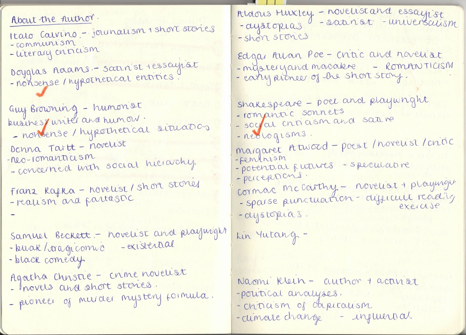
Study Task 1 - About The Author Zine
WHAT WENT WELL:
- Consistency of aeshetic achieves sophistication
- The consideration of media and texture achieves a playfulness relevant to the tone of voice
- Content takes a unique stance on the author, considering sub-topics and secondary characters appropriate to my intent to educate
- Addresses the problem of the accessibility of Shakespeare through universal and comical imagery
-Reduced colour palette achieves the appropriate tone of voice while maintaining a clarity and consistency complimentary to the communication of narrative
- Production and construction of the final zine is neat and well formatted
IMPROVEMENTS TO CONSIDER:
- The author may not be immediate to somebody who doesn't know much about Shakespeare's comedies, despite the visual language being universal of humour and playfulness
- The charcoal pencil has interfered with some of the block colours to create distracting transfers
- The fragmented hand lettering works to compliment the wider aesthetic and tone of voice but lacks clarity in areas
- Could I consider applying some more traditional material appropriate to the context of Shakespeare
Thursday, 28 September 2017
503 About The Author - Initial Sketchbook Ideas
IDEA GENERATION
Carrying forward the identified theme of Shakespeare's sensitivity to the comedic nature of human beings, I wish to start my visual journal exploring character and motifs. Pivotal to my interpretation of Shakespeare's comedies is ridicule and stupidity and so character will be central to the visual development of my work.
Within wider visual culture, Shakespeare only seems prominent through his tragedies so I would like to use this brief as an opportunity to push the visual legacy of his comedies, particularly focussing on accessibility and universality.
Initial drawings have just served as a way of visualising potential interpretations of characters and the scenes they may interact in appropriate to my identified themes. My intent of practice is to capture the secondary characters and their role within the comedic development of the plays. From studying several texts, it seems that secondary characters often drive a lot of the transgression and ridicule, so it seems appropriate to focus on these in order to achieve a playful and comedic outcome that achieves my intent to encourage knowledge of Shakespeare's comedies.
LIMINALITY/ EXCESS OF FOOLERY/ EXAGGERATION/ MISCHIEF
VALUES TO EXPLORE:
- If Shakespeare used comedy to challenge social codes and ridicule his society, how can I use illustration to extend this?
- Illustration as an extension or enhancement of text - what elements do I wish to extend or enhance?
Tuesday, 26 September 2017
503 About The Author - 25 Pieces of Information
Having selected Shakespeare as my author, I have collated my research from his comic works, primarily Twelfth Night.
CHARACTERS
- Feste (court fool/ speaker of moral truths)
- Sir Andrew Aguecheek (secondary character who enjoys revelry, is rarely sober)
- Malvolio (manipulated and ridiculed by unrequited love)
- Viola/Cesario & Sebastian (central twin protagonists who cause confusion and transgression)
- Sir Toby Belch (Lord of Misrule/ conductor of revelry)
LOCATIONS
- Sea/ stormy sea coast (where confusion begins/ liminality)
- Forest (walk between more concrete locations - spot for mischief)
- Illyria GREEN WORLD (removed from ideological codes/ appropriates actions of characters)
- Court (grounding of rule and societal norm)
- Topsy-turvy world (absolute revelry/ saturation of comedy)
MOTIFS
- Cross-garters (humiliating costume/ product of mischief)
- Disguise (justifies revelry/ establishes false personas)
- Twinning (visual parallels/ confusion)
- Carnivalesque (drunkenness/ revelry)
- Unrequited love (emasculation of main male characters)
QUOTES
- 'Better a witty fool than a foolish wit'
- 'I will be strange, stout, in yellow stockings'
- 'Words are very rascals"
- 'I was seeking a fool when I found you'
- 'That quaffing and drinking will undo you'
ALTERNATIVE INFO
- Shakespeare wrote didactic comedies of moral purpose
- Shakespeare's comedies conform to Heywood's structure 'Turbulenta Prima, Tranquila Ultima'
- Intent to release his audience for the social codes an ideological constraints of Elizabethan/ Jacobean society
- Acknowledged by Ben Jonson as 'the wonder of our stage'
- His content is described by Harold Bloom as 'fundamental perceptions'
VISUALS SHOULD BE:
Humorous/ Playfull/ Mischievous tone of voice/ Farce & Mishaps
Wednesday, 20 September 2017
503 About The Author - SONTAG/ SHAKESPEARE/ ADAMS
From studying the list of authors, I feel that I have chosen three that will provide me with a broad base of research that is brought together by an underlying theme of social criticism. Whilst the issue of social critique is present in very different ways, for Sontag it is through her social and cultural observations, for Adams, his awareness of man's anxiety and social instability and for Shakespeare, his absolute criticism of social codes and institutionalised rules, it seems that these authors will requite my interests in observation and the sensitivity of humans.
SUSAN SONTAG - context/legacy/interests/texts
As a writer who predominately observes and criticises visual cultures and ideologies, Sontag is the most complex of my three choices. Studying Sontag would require an investment in abstract concepts and ideas that may revolve around less immediate situations.
Writing in the mid 20th century, her work will no doubt have been informed by many societal changes and be very much moulded by developing ideas of culture. Sontag's aesthetic observations are most of interest to me through her criticism of taste but to focus on this in 503 may be to overlap too much with study of Sontag's writing in COP.
As an activist, Sontag's writing can cover some very evocative and controversial issues which could be testing to my illustration practice. How can I communicate controversial ideas that are not my own through universal, sensitive images?
My primary interests in social criticism drive my interest researching the following texts:
-The Double Standard of Ageing, 1972
-On Photography, 1977
-Illness as Metaphor, 1978
WILLIAM SHAKESPEARE - context/legacy/interests/texts
As a Jacobean playwright, Shakespeare's plays cover many subjects and contexts, but for the purpose of this project, I wish to focus on his comedies. I feel there to be too much existing visual material surrounding his tragedies and his histories seem too direct. Shakespeare's comedies offer a satirical social criticism alongside a sensitivity to the comic elements of human beings.
As entertainment for the courts, his work can be very formulaic and traditional of the Jacobean era, but these comedies also pioneer a different level of humour. Often farcical, his plays can be very clumsy but they also address many social codes which for me requites an interest in social criticism.
I am looking to explore the comedic and mischievous theatrical devices he employs and consider how this could drive playful illustrations that universalise his writing.
Texts to consider:
-The Comedy of Errors
-Twelfth Night
-A Midsummer Night's Dream
I may also study some of the Globe on Screen stage performances as these would aid my understanding of theatrical devices in line with comedic elements.
DOUGLAS ADAMS - context/legacy/interests/texts
Adam's as a satirist and essayist seems to commonly explore hypothetical entities and nonsense comedic situations. Working with fiction, his work naturally invites hypothetical situations, but Adam's work seems to enjoy a saturation of humour. I am aware of his environmental and conservational concerns and I wonder how this may have informed some of his texts.
I am curious to explore his entirely fictional works as these seem so concerned with hypotheses and absolute nonsense. My emerging practice already operates within a humorous tone of voice and I would be interested to extend this through existing narratives. 'The Meaning of Liff' particularly interests me as I feel that Adam's definitions invite some diagrammatic or typological images which would develop the complexity of my image making.
Texts to explore:
-The Meaning of Liff, 1983
-The Hitchhiker's Guide to the Galaxy, 1973
-The Salmon of Doubt, 2002
503 About the Author - Initial Brief Analysis

A new author brief; what do I think?
-need to commit to this author for an extended project
-how can I select an author that resonates with my interests and beliefs?
-illustration and reading are intrinsically linked
-I should choose an author who doesn't have an existing plethora of visual imagery surrounding them-how can I apply my interests and knowledge of literature and analysis?
THOUGHTS
This brief seems like a sort of extension of the 'Persons of Note' brief we did last year, but with more of a focus on authorship and literary legacy. From the outset it seems like the perfect project for me as I said to myself that I wanted to make sure I maintained my interest in English Literature if I wasn't to do a degree in it. In light of this, I feel drawn to some of the more classic authors such as Shakespeare and George Orwell so that I can explore some deeper literary themes, but I am also conscious of not illustrating already known or visually wealthy narratives. As this project is quite extensive, I must consider how interested I am in the author and so I feel something humorous and comical would work to drive my investment of that author in my creative practice.
WHAT I WANT TO ACHIEVE FROM THIS PROJECT
I think at level 4, I was often quite quick to run with an idea and it seems appropriate that with the length of this module, I should invest a good deal of time and creativity into the exploration of ideas. A collection of short stories or excerpts may help me to do this, rather than focusing on a challenging novel. My practice seems almost certainly concerned with sensitivity and humour so I feel that a text of many parts or unfamiliar concepts could be useful to driving the communication in my tone of voice.
WHO STANDS OUT/ WHAT HAVE I FOUND OUT
From the list of authors, I have pretty much ruled out any sort of gothic authors or authors who apply existential themes as I feel these already have a wealth of existing imagery around them and I would prefer to challenge myself with something that I can really play with. Similarly, I feel reluctant to choose science-fiction or dystopian novels as whilst I am interested in the anxiety and social critique of them, I have invested a lot of time in studying these thematically and feel I have exhausted many of these in literature studies. Alternatively, I am intrigued by satire and authors such as William Burroughs and Douglas Adams are standing out to me as being potentially quite experimental and mischievous in their language. Non-fiction also intrigues me as I feel this could be an opportunity to explore some editorial approaches to illustration and work with issues that are perhaps more real and engaging to my potential audience.
3 TO FURTHER RESEARCH
My curiosity mainly lies with humour and social criticism and so I have selected Susan Sontag, William Shakespeare and Douglas Adams, to research in more depth. This selection seems to provide me with a range of different themes and contexts, yet they are all grounded in an element of social criticism.
PLAN OF ACTION
To drive my project forward I must now investigate the authors' legacies and the potential thematic issues I could explore.
-Research each author contextually
-Identify appropriate and relevant texts to study
-Analyse and evaluate texts/author against intent for practice
Tuesday, 28 March 2017


Studio Brief 3 - Persons of Note FINAL OUTCOMES & REFLECTION

REFLECTIONS
STAMPS
Having now completed the photoshop layering process, I have created a wealth of potential outcomes for my stamp responses, alongside complete postcards and poster. Working from 3 postcards and an A2 poster, I have been able to select and manipulate lots of different details to serve as my stamp designs. My intentions for the stamps were to reveal textural details or even zoom in on visual clues. From the wealth of potential outcomes, I have selected the 4 below as I feel that the set are more coherent in a consistent orientation. With the narrative being defined by and revolving around Alan Bennett and Miss Shepherd, it seems appropriate to have two stamps as homage to these protagonists.
My ideas for the other two stamps were to reveal something about the connection between the two characters; the van and the garden. As the van inhabits the garden for 15 years, I wanted to focus in on the van and it's relationship with the nature that carries on around it. I feel this is captured successfully within the stamp series.


POSTCARDS
I feel quite pleased with the flow of my postcards, having the viewpoint of both characters within one context, and of course, the van, seems to appropriately communicate the key elements of the narrative. I had identified in my initial research that watching and prying was key to the relationship of the characters and I feel I have communicated this well across the outcomes. Cut-paper and digital overlays have worked well to encourage me to work with reduced forms, however, I do feel that the image of Alan at his desk is perhaps over complicated and as such, loses immediacy.

POSTER
The poster has been the most successful in communicating the mutual wondering of the protagonists. I feel that this outcome has really benefitted from thorough roughs as there is a clear sense of depth between the figures, yet they both seem to assert a balanced hierarchy. Reduced shapes have benefitted this image by not over complicating the aesthetic. Gestural marks and visual clues have worked to add context and interest, without over-powering the focus on the two characters.
As a whole, I am really pleased with my responses to the brief as I feel I have answered my intentions and thoroughly exhausted other potentials to a point where I feel these are direct and immediate in communicating my intended message. The media works effectively to create a sensitive and nostalgic tone of voice, complimenting reduced forms in their ability to reveal narrative.
Monday, 27 March 2017
Studio Brief 3 - Persons of Note PRODUCTION OF OUTCOMES

PROGRESSION WITH MEDIA
In line with the media tests I have been carrying out in my sketchbook, I have carried forward with the use of gouache and cut-paper, now using gouache to create textures from which I can cut basic shapes. Working from made-textures has encouraged me to really focus in on a reduced palette of complimentary tones, revolving around the iconic yellow of Miss Shepherd's van. I did have some difficulties working on a slightly smaller scale for the postcards than I had been working in my sketchbook but I solved this by creating templates from my roughs in order to maintain the intended aesthetic and shapes.
CHINAGRAPH POSITIVES
Following on from the experimentation with overlays, I have created the textural details and smaller pieces of information on layers of true grain, almost as if creating positives for screen print. Having been looking at the work of Stephanie Wunderlich, I wanted to try and channel her use of overlays and so I have created these drawn layers to overlay the cut paper in photoshop. Working with chinagraph on true grain has achieved a really lovely line quality, capturing textures complimentary to the natural imagery and maintaining the grainy pencil aesthetic explored in my development work.


Developing the images on photoshop, I have scanned in the cut paper layers and the chinagraph positives and overplayed these to achieve mock-screenprint outcomes. Using the selection tool, I was able to select the black lines and fill these with the relevant colours to add textural information to the cut paper shapes. Working with layers in this way meant that I was also able to change blending modes and achieve some overlay effects between tones, further exploring screen-print qualities.
Sunday, 26 March 2017
Studio Brief 3 - Persons of Note ROUGHS
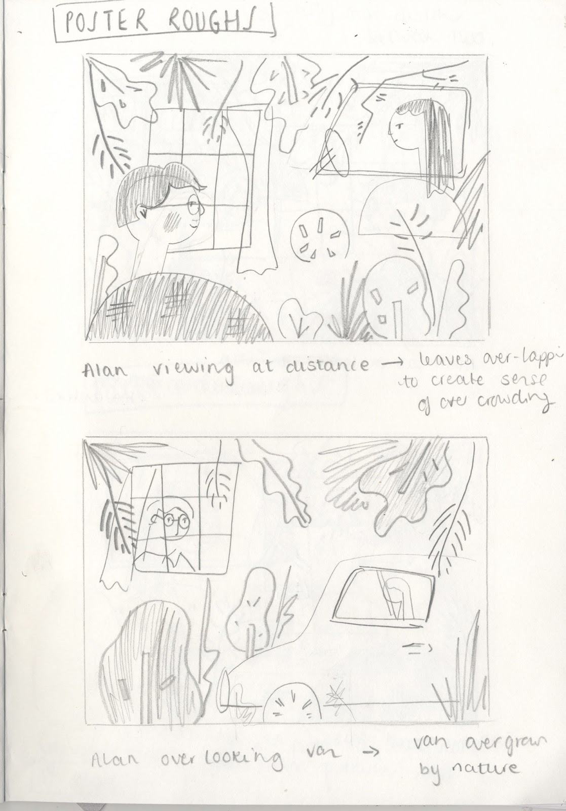
PLANNING MY RESPONSES
Following on from media testing, I am in a position now where I am progressing towards final outcomes. To gain a better understanding of how I will apply the techniques and processes I have been experimenting with I have sketched out roughs for the various deliverables of the brief. Having already explored imagery in my initial ideas and development work, the imagery is already in place but this process of making roughs has helped me to visualise how each image will work within the picture area and particular dimensions.


I feel that roughing is a really useful part of illustration practice as it unlocks new potentials and helps to specify or even simplify the work towards a more resolved and succinct outcome. I have found this to be helpful with the A2 poster as I was really struggling to get my head around how the two characters could interplay with one another through line of sight, yet be at an appropriate depth from one another for the image to be balanced. Working through 5 potential compositions I feel the image has resolved to a coherent outcome.
Through sketches I have been able to also explore how the expressions of the characters work in relation to one another and how these can change depending on the positioning of that character. I think from the roughing process I am now ready to start producing my final images in line with my refined intentions.
Saturday, 25 March 2017
Studio Brief 3 - Persons of Note MEDIA TESTING

MEDIA PLAY
Developing on my sketches, I have started to play with media, developing my images towards more refined outcomes. I have carried out some testing with gouache, duplicating some imagery explored in my sketches. The gouache only tests work well to achieve strong colour values, but I would like to achieve more textural details in my images and so would want to develop this with another media if I was to apply gouache to my final outcomes.
Responding to this, I have explored a reduction of my sketches to their most basic shapes, creating a base for textural overlays. Here the gouache has worked to achieve natural tonal variations from the brush strokes, but in much more refined and simplistic shapes. I have then been exploring how textural details and further visual clues can be over-layed on tracing paper. I feel that this sense of layering is key to the narrative, with both characters wondering who the other really is. The tracing paper has provided the perfect outlet for textural details, allowing me to build the foliage surrounding the characters and information to the characters themselves.
While the tracing paper works effectively within the sketchbook as a means of revealing layers, to achieve this overlay in my final outcomes, I would need to explore digital layering, perhaps using the textural details as a sort of screen-print effect over the basic shapes.


I also have carried out the same process but using cut paper. The block colours work really well to achieve strong and immediate shapes, but I do feel the gouache offered a subtle texture complimentary to the tone of voice. In light of this, I think I may not explore cut paper but from made textures, cutting out these refined shapes from gouache painted paper in order to attain the sleek values of cut-paper, alongside the subtle painterly textures.


VISUAL DEVICES
I have also been considering the visual devices I can use to communicate their mutual wondering and spying. From my research I feel that Alan in confined by his desk and the bay window, and Miss Shepherd confined by her van. For this reason I would like the image to capture both character simultaneously prying, but within the space that defines them. I have been playing around with reduced information, seeing whether just basic window shapes can reveal enough about their environment without impeding on the weight of the characters. Particularly in the image of Miss Shepherd, she is looking out of the van, yet I have challenged this view of her by using overlapping lines to gesture the van, as opposed to full shapes. I feel that this works well as a visual clue, without detracting her place in the scene.
Thursday, 23 March 2017
Studio Brief 3 - Persons of Note FURTHER IDEAS DEVELOPMENT


PROGRESSING WITH TUTORIAL FEEDBACK
Following on from ideas discussed in my tutorial, I have been working through my sketchbook, considering ways in which I could visually communicate the action of spying and watching. While this is not a sinister, voyeuristic spying, I think the idea of them both watching each other is really key to their relationship and the narrative of The Lady in the Van as a whole. Initially working with ink, I was considering rough actions and scenes that could be used to communicate narrative and elements of the characters' personalities. The textures and line qualities achieved from the ink achieve a really nice aesthetic, revealing marks that enhance the natural foliage elements while also carrying a tone of voice sensitive to the narrative.


INTENTIONS
Working through pencil sketches I have visualised multiple ideas in response to the relationship and characters individually, considering activities and events that define their characters, along with events that drive the narrative between them. My intentions are to work with a soft and comical tone of voice, capturing the satirical element of Bennett's writing alongside the warm and feel-good aspect of their relationship. I am intending to develop these drawings through more reduced forms, possibly exploring cut-paper, overlaid with a textural details created with crayons or chinagraph. These may be flexible for development with screen-print of photoshop layering.
FEEDBACK
Having had a further conversation with Matt and Jamie about my progress, we've discussed the effect of these sketches and the success of the translation of narrative. Both tutors suggested that these sketches effectively captured the message I had identified in my research and were readily translatable into final images due to their immediacy. I will now look at developing these with appropriate media.
Wednesday, 22 March 2017
Studio Brief 3 - Persons of Note STEPHANIE WUNDERLICH


ARTIST RESEARCH
To inform the visual development of my project, I have been studying the work of Stephanie Wunderlich. Her cut paper collages and and use of overlays work to achieve simplified forms with textural interest. A balance of block colour against textures helps Wunderlich's work to achieve a harmony. I am particularly concerned with her simplified forms and how she reduces the amount of information in her images to just key components. This use of omission helps Wunderlich to infer meaning through visual clues. I think this is particularly notable in the cycling images as she has used a few clues that give a nod to background details, yet do not over power the main focal points. Single trees and leaves gesture a wider sense of nature and a few gestural marks create an immediate sense of movement.

Despite using rather reduced components, Wunderlich is still able to develop very rich narratives, perhaps through her playful and nostalgic tone of voice. I would like to explore this within my own practice in order to fully communicate the relationship of Alan Bennett and Miss Shepherd whilst capturing the environmental details that inform their situation.
Saturday, 18 March 2017


Friday, 17 March 2017
Studio Brief 2 - What is image making? SCREEN PRINT REFINEMENTS

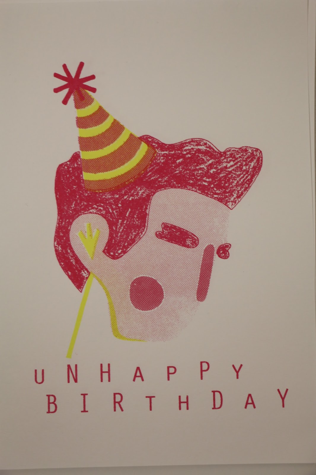
ROUND 2 - NEW POSITIVES, NEW SCREENS, NEW SCREENS AGAIN
After making alterations to my bit-map positives and re-doing the entire process, I have finally achieved some half-tone overlays. Although I did encounter every problem possible in order to achieve this. Firstly, our screen was damaged meaning that the ink was not pulling through properly in certain areas. Fortunately this did impact on my print too much, it was more on my partners side of the screen, but I did have some difficulty getting the text to pull through on my prints.
While the red layer achieved the correct tonal values, the yellow layer, despite having a much larger and more open bit-map, did still not pull through on the face. I have managed to achieve some overlays on the hat, achieving a third, orange tone, but I had hoped to achieve an orange overlay on the face.
Additionally, the yellow layer proved difficult as the screen was also damaged in this area and was only seeming to print fragments of the image so we had to re-expose on a new screen. The second screen, undamaged, created very clear, full prints so we finally started to get some outcomes closer to what we had expected.

Despite the problems we encountered, I feel that our perseverance with the process, and willingness to repeat stages until we achieved a good outcome finally paid off. My prints are still without the intended yellow tones on the face but I think this is something I will just have to practice more with in the future. The tonal hierarchy has worked out as intended and I am glad I altered my positives to accommodate this as the chinagraph has really given strength to the most iconic elements of Morrissey's profile.
I feel that I have demonstrated consideration of composition through line of sight, using the party hat to direct the eye towards the face, and using the text also to frame this as the key part of the image. Value and texture have worked well to place hierarchy on the key components of the image and a central composition has worked to frame the image.
Tuesday, 14 March 2017
Studio Brief 2 - What is image making? BIT-MAP ALTERATIONS

-60% FREQUENCY


SECOND ATTEMPT YELLOW LAYER
-25% FREQUENCY

FIRST ATTEMPT RED LAYER
-60% FREQUENCY

SECOND ATTEMPT RED LAYER
-25% FREQUENCY
After the first screen print, I had found my bit-map positives to be ineffective due to the dots being too small and tight. I had initially worked with a resolution of 300 dpi and a frequency of 60% which was a guideline I had followed but unfortunately did not work for this particular print. To alter this I reduced the frequency to 25% to create larger, more spaced out dots which created a much more open and clear bit-map outcome.


I also took the opportunity to refine my initial positives as I had decided that the colour values were not in the correct hierarchy. With the subject of Morrissey, I felt the hair and eyebrows were most iconic and therefore needed to be the strongest values in order to achieve a compositional hierarchy. I have therefore substituted the block red and half tone reds with one another, also using chinagraph to introduce another texture.
The use of chinagraph texture works well to add interest to the hair and eyebrows. With these being the main components of the image, I felt this would achieve a more effective outcome than areas of plain block colour.
Hopefully with these alterations I should be able to produce some more successful outcomes in the print-room, and hopefully achieve some half-tones and overlays this time.
Subscribe to:
Comments (Atom)