Tuesday 28 February 2017

Studio Brief 2 - Act of Kindness ANNA KOVECSES VECTORS


PRACTICE
I've admired the work of Anna Kovecses for a while for her really sophisticated use of colour and shape, something that resonates really well with the new brief. Working with vectors, Kovecses achieves a really sleek aesthetic, attained through reduced, minimal forms. 

Something I think is pivotal to Kovecses work is her consideration of symmetry and interplay. I think these considerations are possible what makes her work so effective as they maximise the use and effect of these reduced forms. Allowing shapes to overlay and interplay with one another allows abstract elements and unconventional motifs to be created, demonstrating the value of simple visual clues to control meaning. 


IMAGE
This image shows consideration of repetition and symmetry, using one simple visual device to denote a person, Kovecses creates an immediate illustration promoting togetherness and community. Repetition is something I could explore in my own work to keep a consistent and simple aesthetic.

A success of kovecses work is the way she employs irregular shapes and wonky lines to echo qualities of cut paper. This not only challenges the often rigid and angular look of vector-based work, but injects a sense of crafting, contributing towards a sensitive and playful tone of voice. 


Monday 27 February 2017

Studio Brief 2 - Act of Kindness DEVELOPMENT OF IDEAS

REFLECTION
Developing on my initial ideas and sketches, I've tried to break down my ideas down, working through pencil, colour pencil and cut paper within the given dimensions to explore simplification. This process has worked really well to help me realise some more reduced and immediate visual devices.

Exhausting potential responses has enabled me to identify the most effective imagery and most suitable forms to create basic shapes from. The process of working through various stages of simplification to cut paper outcomes has been particularly helpful in helping me to realise forms that could be rendered as vectors for the constraints of the brief.

INTENTIONS
Cut paper has also forced me to work within the restricted colour palette but I would like to explore overlays on Illustrator to maximise colour potentials.

I feel that the flowers, socks and shine bright designs are currently the most effective responses through their simplified forms and immediate messages. While the brief only asks for one final outcome, I intend to explore all three potential responses in Illustrator. 

Thursday 23 February 2017

Studio Brief 2 - Act of Kindness INITIAL IDEAS

STUDIO TASK
As a starting point for our new brief we worked through a grid, aiming to simplify step-by-step, how we could communicate an action. This was a great exercise in getting me to thing about reduced details and key visual information. While I think I did achieve more simplified images, my final cut paper outcome seemed a little backwards of the progress I had achieved. The hands definitely achieved a more simplified outcome by cropping closely into these, but I feel the decorative details on the yoyo were perhaps unnecessary, merely decorative. This is something to take forward into my design work however, that shape and form carry greater clues than decorative details. 
INITIAL SUBJECT IDEAS
-feed the birds
-shine brighter than the sun
-give flowers
-share your heart
-send a letter
-knit for the needy
-be a clean bean
-jazzy socks make happy feet
-look after squirrels
-nourish your imagination
-look after yourself
-encourage play

SKETCHBOOK
Having formulated a list of potential subjects for may act of kindness, I've started working through these, considering basic motifs that I could use to encourage the act. At the moment, some are proving easier than others. The actions that can rely on one subject rather than an interplay of two seem to be easier to simplify as less visual devices are required. At this stage in my sketchbook, the jazzy socks are seeming to be quite successful in simplicity, and the flowers also. I think this is because it is easy to identify the action in these images without necessarily needing any secondary clues. 

To attempt to achieve simplicity in the more complex actions, I am intending to work through a simplification process similar to that carried out in the studio task, working towards a reduced cut paper outcome. This should hopefully enable me to visualise the designs in their most basic forms, lending the work to development with vectors.

Saturday 18 February 2017

Studio Brief 2 - What is image making? SCREEN PRINT OUTCOME


REFLECTION
Unfortunately, the use of bit-map has not had the desired effect on my design. I did double check my positives with the print technicians prior to exposing but they said it can sometimes just be trial and error with bit-map. I intended the face being a light orange tone, with small dots of both red and yellow creating a third colour. Unfortunately, the ink didn't pull through in this area on any of the prints. Similarly, the party hat should have shown orange tones but these failed to reveal also.

Despite the absence of half-tones and overlays, I feel that the blank areas to add to the simplicity of the image and the block line used to describe the jawline enables the face to remain clear. 


COMPOSITION

Attempting to consider the elements we have been studying in visual language, I tried to use diagonal lines to direct the eye around the image, using the party hat to extend the image into the corner of the picture area, whilst also creating a line of sight leading to the main character. Using horizontal text, the text is clear but also seems to work as a frame to the head. Despite the failure of the bit-map half tones, there is clear variation in values, I would however alter these when I alter the bit-map in order to change the importance of components.

PLAN

I am hoping to make time to re-do these prints as I feel the outcome could be much more successful. Having discussed my initial outcomes with my tutors, I am going to re-make my positives using a more open bit-map frequency which should hopefully be more clear when exposing. I also intend to alter the values of the facial features. I identified in my designs that a key motif of Morrissey was his eyebrows and quiff so it seems to make more sense to have these as block colours to create a clear trope of his character, and change the nose and cheeks to half-tones.

Studio Brief 2 - What is image making? USING BIT MAP


CONSIDERING TONE & VALUE
Responding to the suggestion to use bit-map as a means to achieve value and tone within the screen print, I've broken my images up into 3 tonal variations. Using a grey fill, I've separated the image into areas that will be block red, block yellow, and two tones of orange where overlays are varied. 

Having not used bit-map before, I'm not too sure how these will work. I've adjusted the frequency of dots to 60% and 300dpi but this could be something that takes a bit of experimentation to get right. 

As I made the positives by scanning in a line drawing, it was difficult to avoid an outline around the shapes. I made the decision to erase this line, hoping that the empty space would contribute to the charm of mis-alignment in the screen-print outcome. 

I will re-evaluate the effect of bit-map after a first run of prints and make adjustments to my positives if necessary. 

Studio Brief 1 - I See Faces FINISHED GIFS

1. HAND DRAWN
I'm really pleased with the outcome of my hand-drawn gif. I feel that I have been able to maintain the playful aesthetic of my initial drawings, yet with a consistency that aids the effect of the gif. Creating one static grounding in watercolour meant that each frame showed a consistency, while maintaining a hand-made quality. I feel a success of this gif was the decision to use only subtle movements as I think the nature of the media would have created a very inconsistent aesthetic had I had to draw each frame uniquely


2. 3D 
Wooden blocks worked so well in the 3D gif. I think using existing forms to my advantage worked really well. Re-appropriating these with digital lines seemed to add comedy and enhance the playfulness of the objects. It could have been interesting to animate a full figure in this way also.

3. DIGITAL
The digital outcome has not been as successful as my other two responses. I'm pleased with the consistency across frames that I achieved by digitally colouring hand-drawn templates. However, I found it very difficult to achieve clean line from this process of selection and erasing. I may look to refine this using digital shapes to foster a cleaner outcome. 


Overall I feel my gifs work really well as a series. Despite the contrast in media, I think these demonstrate a consistent translation of character. From looking at the work of my peers however, I wonder if I could have made more variation across the three gifs. 


Friday 17 February 2017

Studio Brief 2 - What is image making? SCREEN PRINT DESIGNS

FAN ART
-simplification
-visual clues
-minimalisation of imagery
-key information
-restricted colour palette (2)
- use bit map to explore value

TROPES AND MOTIFS
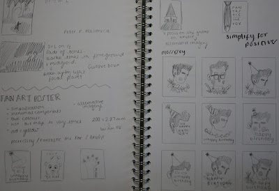
Responding to the brief to create a 2-colour screen print, I have roughed some initial designs considering visual clues and key imagery. What is key about that character? What defines them? I started working across 3 subjects, Fantastic Mr Fox, Amelie and Morrissey. I've chosen to progress with Morrissey as the other two, being films, already have a plethora of images and motifs surrounding them. I feel Morrissey will be a challenge for me to explore visual clues relating more to personality and character as opposed to a predefined narrative. 

An aesthetic motif I believe to be key to Morrissey is thick eyebrows and a quiff so I have been exploring how these can be used as visual clues to create a simplified portrait that is easily aligned with the subject. Working with these conventional tropes of Morrissey has also enabled me to omit other facial details that lack the same level of importance, reducing the design to basic shapes. 

A trope of the character's personality is misery and so I have chosen to play on his song 'Unhappy Birthday' to create an ironic image of Morrissey, wearing a party hat. The hat, simple and direct, works as an immediate clue, seemingly comical when juxtaposed against the character.  I intend to add text to enhance the message of this for wider audiences. 

PROCESS
With the brief requiring us to explore value and the use of bit-map, I have broken my design down into positives, and explored the overlay of colours through rough drawings. I intend to use a line drawing as a template for a photoshop development which bit-map can be applied to. 

Studio Brief 1 - I See Faces PRODUCTION OF GIFS


Now in the production stages of the gif project, I am working towards final outcomes, using templates from my flip-books and rendering these though photoshop development. For the hand-drawn gif, I have created a simple water-colour grounding which forms the body of the figure in every-single frame. This is over-layed with pencil marks to determine the alterations between each frame, also scanned in and placed on photoshop. While the hand-drawn gif should show hand-qualities and natural curiosities, I felt that working with a consistent grounding made the most sense as the watercolour would vary too much from frame to frame if each grounding was unique.


For the digital gif I have been working with hand-drawn outlines of each frame, used as templates to colour digitally in photoshop. While this process works to maintain a consistent colour palette and the hand-drawn outlines are more accurate than a digital translation, I have struggled to achieve clean edges from the selection and fill process. This could be something to refine by exploring making the characters with digital shapes. 


Photography has worked really well for the 3D gif as I have been able to re-appropriate existing objects by simply photographing them and working into them with digital drawing. This way I have been able to echo the blocky qualities of my characters in material forms and achieve visual interest through shadow. I am now in the process of adding digital details using the pencil tool on photoshop, merging media as shown in the gif work of Ed Cheverton.

Monday 13 February 2017

Studio Brief 1 - I See Faces EXPERIMENTATION & TESTING


3D EXPERIMENTS
Furthering my study of Ed Cheverton's work, I have experimented with wooden blocks as a means of building characters. I've used existing children's building blocks to explore re-appropriation of existing objects. These have worked to compliment the playful qualities of my characters.

Using the pen tool on Photoshop, I've tested digital drawing to add another visual quality to the work. Simply using the computer mouse, the lines are a little unrefined but I feel this adds to the charm of the characters. 


Moving towards an animated outcome, I intend to use the wooden blocks to describe more regular movements and layer these with digital pen drawings to achieve additional gestures that are perhaps more subtle but less refined


DIGITAL EXPERIMENTS
I have also tested an entirely digital approach, creating shapes and transformations on Photoshop. While this test is very basic and reduced, it has enabled me to practice the animation process through use of frames and layers. As I work towards more refined gifs, I would like to consider more extended movements.

While the brush tool here answers the 'digital' constraint, I am interested to achieve a more consistent and refined aesthetic by scanning in drawn templates and colouring these digitally. This should hopefully maintain the blocky qualities of my drawings and 3D outcomes. 

Saturday 11 February 2017

Studio Brief 2 - What is image making? COLOUR, VALUE & NOTAN

SEMINAR DISCUSSION POINTS

What role does value play in planning composition?
-Controls and accentuates the mood of an image
-Similar to line of sight, the eye is drawn to the greatest contrast of values

How can we use values to focus attention or certain information?
-Using varying tones to make contrasts between elements
-Using stronger contrasts of value to give prominence to key components

What is a colour palette?
-Selection of colours you are applying to an image

The most common basic value plans:
-light against dark
-dark against light
-dark and halftone against light
-light and dark against halftone
-up to 3 values

NOTAN - Japanese idea of black and white harmony


Colour and value is key in the work of Herge. Notable in his Tintin illustrations, Herge applies contrasts of colour to determine the key components of his images. While variation is evident in the jungle textures and green tones, Herge applies warm yellows and oranges to his key components. This works not only to allow the different elements to stand away from one another, but also assigns importance to the elements that are carrying the narrative. 

Friday 10 February 2017

Studio Brief 1 - I See Faces GIF PLANNING

RESPONDING TO FEEDBACK
Following on from feedback received in my group crit, a concerned raised was the consideration of picture area. In my sketchbook I had been working with vignettes on busy sketchbook pages so I have done some rough plans of how my gifs will work within the square frame. Movement is not too much of an issue with two of my intended gifs, but one requires movement of the whole figure so picture area will need to be a key consideration. 

PLANNING
I have drafted out some initial story boards considering simple movements that each gif could show. Some employ just one single movement, whilst others use a few basic gestures to create a more overall sense of movement. Having worked through multiple possibilities, I have selected the most effective and worked through these with basic flip books and re-drawn my storyboards. This is really helped me to figure out how movement will occur within the picture area and how the character need to change in line with a looping gif. 

In digitally producing these I will be able to manipulate single frames to create multiples that can enhance the extent of movement or length of the gif. 

I have also begun drawing out the components and frames for my final gifs. Using layout paper to ensure consistency and registration of frames. I will continue to develop my final gifs by completing these templates and rendering necessary components on photoshop. 

Next I also need to experiment with the 3D media, I intend to use wooden blocks to achieve a sense of playfulness associated with children's toys. It will be necessary to play with potential forms and compositions in order to use the 3D objects to their best effect. 


Wednesday 8 February 2017

Studio Brief 1 - I See Faces ED CHEVERTON GIF

I've selected this gif from Ed Cheverton as I feel it resonates well with my concerns with humour and mischief, particularly within the context of children's illustrations.

Cheverton's mix of 3D and 2D media creates imagery that is playful yet sophisticated through the considered use of layering. The subject matter of 'toys' is complimented so well by the characterisation of 3D objects, showing the value of media in message.

The overall effect of the gif is fun and playful, with lots of separate movements. But when it is broken down, Cheverton has just used multiple subtle movements to gesture a greater sense of action. This could be a useful element to consider in line with my own gifs as my character could be characterised by simple movements or twitches.

With my intentions to use wooden blocks for my 3D gif, I may take inspiration from Cheverton's work and add to these with digitally drawn features to achieve a similar sense of layering. 

Tuesday 7 February 2017

Studio Brief 1 - I See Faces GROUP CRIT FEEDBACK

SUCCESSES
The task of having to fill a sketchbook in a week seemed rather daunting at first but I'm glad I filled it as it provided me with a good body of work on which to gain feedback. The crit provided me with some new ideas, and a lot of positive feedback on my current outcomes. The main issues discussed around my work were the characterisation of shape and  the interpretation of sound through shape and gesture. My peers seemed to think that the shape based work responded really well to the qualities I had identified in the song, and worked well to create subjective and interpretive outcomes that were simplistic and universal in message. Block colour was also pointed out as an area of strength in my sketchbook as my peers thought it complimented the aesthetic of the shapes and the playful tone of voice I was trying to achieve


DEVELOPMENT POINTS
A development point raised was the necessity of facial features. We had discussed the value of irregular forms and simplicity and this made us all question how much information there needed to be on the faces of my characters. The body formations are so charged with character through their irregularity and gesture so it now seems to make more sense that my character faces are reduced to their simplest forms. 

Further to my characters faces, my peers questioned the action and narrative of the characters. Within the frame of the gif, what were they doing? How was the composition going to work? Up to this point I hadn't really considered picture area, I was focusing more on the shape and content of my work. Some suggestions were made about having my character dancing or jerking sporadically to echo the qualities of the sound. This is something I had intended to explore, creating a simple narrative around dance that reveals the audio characteristics of the piece.  

The crit also invited my peers to make visual suggestions, shown in the image above, considering modifications and potential narratives and movements. These have helped me to get a better idea of how my characters might translate in a moving gif and how I might develop them in line with a narrative. I think this will require further roughs and testing in order to understand the potential actions of each gif. 


REFLECTION AND NEW AIMS
In light of the suggestions and praise received, I will continue to develop the blocky, irregular shape qualities in my work but start to consider a reduction of information. How little visual information can I get away with? Exhaustive drawings of possible faces in my sketchbook will be essential to the development of a more simplified outcome and I will need to explore media in order to develop a character that is compatible with animation. I will need to give particular consideration to the 3D gif as this will alter the form of the character most signifcantly. For this I may explore the use of cut paper and collage in order to achieve subtle movements that maintain the intended form of the character.

Monday 6 February 2017

Studio Brief 1 - I See Faces FURTHER CHARACTER DESIGN

INITIAL REFINEMENTS
Following on from the work I started to produce in water colour, I have begun refining some of the most successful characters from my initial designs. I have chosen to refine the characters that I think most effectively capture the sporadic and blobby qualities of the sound, and mainly the designs which are most simplistic. I feel these will lend themselves more appropriately to animation and will be effective when animated as there aren't too many components to fight for attention.


An element I identified as needing refinement was the rigidity of the shapes in my characters. The character above had begun with straight legs in the earlier stage of my sketchbook, but I felt that to fully communicate the transience of sound, a more wiggly, free form would be more appropriate. When animating, it could be interesting to explore how the limbs echo sound waves.

I have also been exploring faces and expressions, experimenting with simple marks and lines that take on the basic forms of facial features without creating over characterised expressions that detract from the interest of the irregular body forms. I'm aiming to work away from the human form in the proportion and movement sense, allowing my characters to move and extend in abstract ways. To compliment this I may look to develop my abstract visual clues to communicate facial features, so not to clash with the aesthetic of the main figures.


MODIFICATIONS
I'm finding the use of limited colours really effective against the shape based characters. Using one or two block colours communicates the rather playful tone of voice, whilst complimenting the simplicity of the shapes. Working over the coloured areas with black seems to work well to reveal details and add more visual clues, but I may have to re-think this approach when developing the character for 3D design as it will be difficult to achieve this interplay of media and the line based components will possibly have to be substituted for shapes.

Friday 3 February 2017

Studio Brief 2 - What is image making? DEPTH & LINE OF SIGHT Over There


DECONSTRUCTING OBSERVATIONS
Considering the points outlined in the seminar, I went on to make observational drawings that considered depth and viewpoint. The body of drawings were made looking out of the same window, but took in various viewpoints, observing the aesthetic of the same buildings from different angles.

With the brief to create a diorama or layered drawing through deconstruction of drawings, I tried to work with more simplified drawings, capturing basic shapes and surface details. In deconstruction of these, I altered the scale of the components to exaggerate the distance between the layers and accentuate the sense of depth.


I feel the outcome captured a good sense of depth through scale and overlapping, however the outcome did not necessarily achieve a diorama effect as I chose not to leave gaps between my layers. This was a choice, mainly for ease of production within the time frame. I would be interested to explore depth in a more 3D sense on future work. 

Studio Brief 2 - What is image making? DEPTH & LINE OF SIGHT

SEMINAR DISCUSSION POINTS

What is depth in an image?
-Illusion of distance or 3rd dimension
-Can be created by overlapping objects to create a sense of order
-Varying sizes can make smaller things appear further away

Is depth only relevant to image makers who want to make 'realistic' images?
-Depth is a tool for importance of components of an image
-It is not only to make realistic images but to create hierarchies

What is line of sight?
-The line the eye takes to observe each component in order of importance
-Determined by the position and value of each element

What does line of sight do for composition?
-Line of sight can make the viewer feel like they are engaged/ part of the situation
-Using props to describe space and direct focus to point of interest

How does movement relate to line of sight?
-Movement of an object should work in unison with line of sight
-Does the movement of the object drive the viewer towards the focal point?

The line of sight can echo the action of a scene, conflicting lines of sight can achieve a flux to reveal a violent scene, while smooth lines echo harmonious scenes.


Observing the use of depth and viewpoint in existing illustrations was helpful in my understanding. This illustration from Laura Carlin demonstrates successful consideration of depth through the main figure occupying the foreground and the secondary figures reducing in size towards the background. This approach to composition allows the main figure to maintain the focal point, yet allows the eye to be directed towards the head of the figure through the line of sight created by the secondary figures that occupy the surrounding picture area. 


Thursday 2 February 2017

Studio Brief 1 - I See Faces INITIAL CHARACTER DESIGNS

DRAWING WORKSHOP
The drawing workshop with Dominic Kesterton helped me to understand some basic approaches to idea generation that I could apply to my character design. Thinking about alterations to line, shape, exaggeration of scale and inversions, we quickly made a wealth of variations from one starting point. I think these are values that I could take forward in response to the music I have been allocated, perhaps considering how specific sounds might transform as shapes. I have started to consider this through sound mapping.
SOUND MAPPING
Responding to my chosen song, Inspector Norse, I've commenced the design process with a sound map, recording shapes and marks inspired by the sounds and sporadic nature of the piece. Some take on more textural roles, whilst other could be developed to take on abstract body forms. I found this exercise really useful as a starting point as I just through myself into the song and let my pencil start to form the basis for my characters.


MANIPULATING MARKS AND SHAPES
Taking elements recorded in my initial sound map, I started to work into marks and shapes with a heavy black pencil with which I added faces and limbs. Not too detailed but just enough to work as a clue that these shapes were characters. While these worked well to document the audio qualities of the song, I feel that the more mark orientated characters would be difficult to develop and manipulate for a gif as they don't have a strong sense of form. This could make registration difficult and movements would need to be quite gestural to contrast against the busy textures.


Further initial ideas are taking the form of water colour drawings. This media has worked really well in enabling me to explore the fluidity and transience of the song, particularly the more immediate and 'blobby' qualities in the sound. Working with more blocky shapes, I've found it easier to characterise these and manipulate them into abstract body forms. I think these could work really well in the gif context as the irregular shapes could be quite easily manipulated across media and they seem to effectively capture the characteristics and qualities of the piece. 

INTENTIONS
I will continue working on these more shape-based responses to the song and start to consider faces and movement in order to fully communicate the character and narrative of the piece. I think it will be interesting to see how my characters tell a story as there are no lyrics to the piece so this will be a purely incidental outcome, yet the tone of voice of my work will no doubt incur a sense of playfulness.