Sunday, 27 November 2016

Studio Brief 1 - One Week Map SCREEN-PRINTING


CREATING POSITIVES
Processing the research and observations we had collected, we made the decision to use the 2 parts of the screen print to communicate 2 senses. The base layer documented a linear journey through sound, using experiential sound mapping marks to create base textures, marks that provided clues to characterise to 2nd layer. The top layer ended up documenting the activities and places more literally, applying drawings from all of our sketchbooks to create one map of the day.

While this separation of sensory observations worked well to provide clues and textures to support more representational imagery, I feel it may have worked better had the positives either been produced with a consistent media, or with more minimal details as the end positives seemed to fight to much for attention and the journey seemed less coherent.


SCREEN-PRINTING
The final prints seemed to achieve more clarity due to the choice of colours, however I feel to develop the outcome, we could perhaps look at creating more complimentary positives. Playing with inks provided some interesting qualities. Merging primary colours with their corresponding secondary colours achieved an interesting marbled effect, seeming to compliment the textural qualities of the chinagraph. Experimenting with registration and overprinting created some nice depth and textural details. 


Friday, 25 November 2016

Studio Brief 1 - One Week Map

TASK: PRODUCE A TWO COLOUR, SCREEN PRINTED MAP

Be a PSYCHOGEOGRAPHER...
exploring places through emotions, senses and connections to the places.

The Day
-Set out to collect research and experiential drawings
-Investigated the sensory qualities of each location
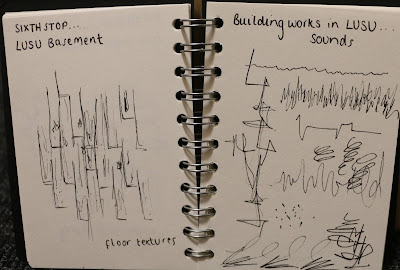
-Documented our experiences through sound maps, experiential drawings and notes
-Collated our research and presented our findings

MY OBSERVATIONS
It was interesting being set a task in which we had to really observe the 'everyday'. Taking a simple walk around Leeds, observing subtle details and really taking note of our senses created an instant wealth of material from which to work on. Sound mapping served as a good tool for documenting the character of a location, and the experiences that informed it. These gestural marks seem to incidentally create patterns and marks that could make up a more formal and regimented pattern in response to the day. I felt that line value and line quality was a great way to document observations as the lines quickly capture the character of a zone and experience.


It was quite rainy so we tried to document inside spots. A particularly interesting location was the Leeds Uni students union as there was building work going on, alongside a farmers market so we were able to observe a wealth of activities. 

REFLECTIONS
At the end of the day I found that I had focused more on surfaces and sounds than on visual clues but as a collaborative task, my peers had collected valuable observational drawings. 


To produce a screen-print from this research will require some processing of the information. To develop my observations into a more linear account I will need to put my sound maps into chronological order. These may be effective as a sort of base to the map, acting as a sensory background to more representational drawings. 

Looking at the work of my peers, it seemed we had all been on an entirely different journey, and collected a wealth of different observations and ephemera. The group I was working with took a mainly sensory approach while others focused on collecting and observing objects that characterised their locations. It will be interesting to see how the different approaches are processed for a screen-print.

Friday, 18 November 2016

Studio Brief 1 - What is drawing? SHAPE AND TEXTURE


Analogue approaches to image making seem to incidentally create unique details and visual curiosities. While flat colours and hard edges have an immediacy suitable to quick communication, it seems the tone of voice of an illustration can be more thoroughly explored through shapes and textures.

SIMPLIFYING IMAGES

The task set to encourage exploration of shape required a restricted colour palette of 2 colours plus black, using cut paper and black in any medium. I found this constrained approach to image making interesting as I had to give more consideration to the information each shape and component provided, aiming to use minimal information for maximum effect

Simplification worked most successfully in the images where gestural lines, and incomplete lines were used to infer the shape. This worked to provide a visual clue without over complicating the image, using shape and line to tap into the universal image of the vegetable


APPLYING TEXTURE

Applying similar approaches to a self portrait, I also considered texture, through handmade marks. Using a multitude of crayons and paint, I created  a bank of textures which I cut out to create elements of my image. Not only do these components introduce textural details, the cut paper also offers a handmade quality, giving a sense of crafting within the image making. 

In light of my previous work, the process of working with cut paper enabled me to work more flexibly with the action of my character and composition of the image, being able to play around with the positioning of the paper. I feel that collage would be a good approach for me to develop as I can employ the textures I enjoy, within a process that is more fluid and flexible, to give more scope to my practice.

Sunday, 13 November 2016

END OF MODULE EVALUATION

As I commenced this module, I was unaware of how abstract or simplified an illustration could be, yet still communicate on a sophisticated level. Working across the module, I feel my approach to image making has become more about the meaning that can be drawn from clues rather than given to you through a literal image. Reaching the end of the module, I have been exploring visual clues and the idea of minimal information. Developing an awareness of the contexts illustrations can operate in also encouraged me to consider new approaches to image making as function and audience can entirely subvert the needs of an image. I feel that the main component I was influenced by was colour palettes. With briefs that demanded monochrome or 2-colour palettes, I had to maximise the application of these colours through manipulation of opacity and layering. My familiarity with screen-print mimicking techniques on photoshop enabled me to foster the aesthetics of print through overlay and misalignment to produce my editorial work in a quick turn around. With print as a medium I would usually work in, it was interesting to practice some print characteristics digitally to explore new potentials.

Collage and cut paper has also allowed me to explore shapes and texture. Experimentation with collage is discernible in my sketchbooks and outcomes from the ‘How To’ and ‘Judge a Book by it’s cover’ briefs. Shapes and textures compliment the application of a restricted colour palette as the edges of different patterns against one another work to create definition and mark a boundary. For me, a success of the ‘How To’ poster was the consistent use of collage across the vignettes, but a varying pattern across these textures to maintain the blanket as a permanent focal point. 

I often concern my work with characters and while this worked successfully in the ‘How To’ poster to achieve consistency, I have learnt through reflection and feedback that these can be too personalised. Within my editorial roughs I explored characters but I found the very nature of editorial illustration, being for a wide audience, begs universality and simplicity. This pushed me to reject my usual approach to problem solving and initiated a more clue driven approach to image making. 

An area I feel I need to develop is my use of time. While I have met all stages of the module, I have found sometimes that I have been trying to squash development work into too small a window, meaning my ideas have not been able to develop as organically as they could. I have found however that the blogging process enables me to realise my thoughts by documenting these and attempting to make sense of potential ideas. Blogging my reflections and feedback on my ‘Judge a book by its cover’ roughs helped me to make sense of what was missing from my ideas. Having researched around the theme of my book and working to issues of culture and compromise, I hadn’t successfully captured the unity discussed in the book. It was only through blogging and talking to my peers that I realised I hadn’t integrated the components of my images fully, helping me to form a strong base for development. I think a greater sense of development is notable within the book cover project as I have made more technical and practical alterations to my roughs than in other projects. 


To develop my illustration practice, I will look to focus more on the development of my work from ideas to outcome rather than staying hung up on initial ideas as these are just starting points that can feed a stronger outcome. In light of this, a greater exploration of media would be effective in order to make more informed choices when producing final outcomes. 

Saturday, 12 November 2016

Studio Brief 3 - Judge a Book by its Cover... FINAL OUTCOME

Finished at last!!

Developing work explored in my roughs, sketchbook pages, and from feedback comments, I have brought together the most successful components into one cohesive book jacket. I'm really pleased with the outcome as the hat stand image has worked really well to make the most of the space, while not taking clarity away from the text. The restricted colour palette I have applied enables the use of multiple smaller images to not overpower the whole aesthetic and these muted tones offer a sensitivity that compliments the theme and imagery. I am slightly disappointed in the outcome of texture as this appeared very prominent when working on photoshop but the details seem to have been lost slightly on printing. Texture could be explored through hand painted textures if I was to develop this outcome as they may demonstrate more tonal variation and greater marks

The use of single hats on the wrap around panels nods to the theme and imagery of the main cover without creating a distraction from the main image. I would like to consider a repeating pattern when next addressing a brief like this but I felt the process and detail of the hats was too complex to not restrict the impact of the main cover image. 

Thursday, 10 November 2016

Studio Brief 3 - Judge a Book by its Cover... DEVELOPMENT


Working towards a final outcome I have chosen to develop the hat motif explored in my roughs. It was suggested to me that I consider a more unified approach to the images, considering how the hats are connected to each other. In light of this I have explored the idea of hats on a hat stand. To experiment with composition I photocopied the hats from my initial drawing and cut these out so they could be placed and moved on a paper hat stand to enable me to explore multiple compositions. I feel that at this stage, the hat stand is making much better use of the space as it allows for the text to have its own space, yet the page is full. Working with cut outs in this sense encouraged me to explore digital collage. Taking inspiration from Louise Lockhart's work, I cut my shapes out on plain paper and scanned these in. Using the magic wand tool I was able to make easy selections in order to separate the hats and work on them as separate layers. This process worked successfully for the book cover as composition has been a main focus and I have been able to constantly change and manipulate the layout by working digitally. Clearing the selection on photoshop meant that I was able to drop in my chosen colours, and add texture through the dissolve brush. I am very pleased with the results from this process as the cut outs have achieved a hand cut quality while taking on the qualities of a digital collage with digitally made textures and colour. 

I have made the decision to use the hand drawn type explored in my sketchbook and roughs. This decision was made based on the hand qualities and curiosities the process produces and the unevenness of the brush marks as these add to the charm of the handmade approach. Working towards a final outcome I have scanned this lettering in and applied it digitally to avoid any errors and to enable me to resize and alter the text to the most successful scale and position

Tuesday, 8 November 2016

Monday, 7 November 2016

Studio Brief 3 - Judge a Book by its Cover... ROUGHS

Following on from my initial sketches, these are the 5 roughs I produced for our crit on Monday. I am quite happy with the outcomes as I feel each one considers a different interpretation of the theme of the book. In the rough that uses bright triangles I chose here to take a more abstract approach to the illustration of the theme, using geometric shapes to explore a jigsaw/ puzzle motif, connecting with the undertone of cooperation and learning to fit together in society. I do feel however, that this cover is too abstract and does not create a clear enough impression of the book. 

The use of hats in another of my roughs has proven successful as these take an alternative approach to the idea of culture and rituals. This imagery seems to give a fun feel to the subject matter, yet also symbolises a variety of issues within the book. From feedback I received I may look to consider a more unified approach to the hat imagery as it was noted that while these do illustrate multiple cultures, they are not connected with one another visually. To develop this I may explore the idea of hats on a hatstand to introduce that sense of unity.

On reflection, I have found the images that illustrate a sense of diversity and community are the most successful as their use of multiple smaller images creates a pattern like images, yet captures the essence of the book clearly. I may look to develop my other ideas in line with this through experimentation with multiples and repetition.

Saturday, 5 November 2016

Studio Brief 1 - What is drawing? MARK MAKING AND TONE Visual Subject


APPLIED MARKS
Following on from the generation of marks and studio task, I have practiced these marks applied to my visual subject. As an exercise in exploring the application of marks and the functionality of marks, these drawings work well to demonstrate the tone of voice and texture that can be achieved from mark making approaches. However, in attempting to explore multiple mark making devices, I feel these images lack clarity and consistency. 

CLARITY THROUGH COLLAGE
Referring back to the house design I made, applying mark making though collage, the outcome achieved much better clarity through cut shapes, allowing marks to operate their own space without the interference of clashing qualities. The collaging approach therefore seems appropriate to the use of mark making, as a means of using textural curiosities in a way that maintains readability and form. 

A weakness of these drawings I think is the use of too many media within one image. It would be interesting to explore the effect of one media on mark making across a single image and how this alters the immediacy and readability of the image.

Friday, 4 November 2016

Studio Brief 3 - Judge a Book by its Cover... INITIAL IDEAS


IDEA GENERATION

The ability of illustration to create an impression about an idea or theme suits the discipline perfectly to book covers. With studio brief 3 asking us to create a new cover for an existing book, I began by brainstorming the impression I got from the existing cover, and the themes I could draw from the introduction. Working with Richard Sennett's TOGETHER, I considered ideas of unity, compromise and balance, diversity and tradition, thinking about the elements that inform our ability to cooperate.

Exploring these themes, I drafted motifs and potential covers in my sketchbook. The idea of diversity and unity seemed to lend it self to imagery of different ethnic backgrounds and cultures, while the idea of compromise suggested a balance motif to me. Working through these ideas in my sketchbook I have considered the image as a repeat pattern, as a picture spanning the whole jacket, and as a single image occupying just the front page. In the production of my roughs I will get a better sense of media and composition but at this stage I feel my initial ideas capture a multitude of interpretations and have potential for development into different compositions depending on how I chose to use the book jacket. 


Thursday, 3 November 2016

Studio Brief 2 - Illumination... FINAL OUTCOME


REFLECTION

Exploring simplistic imagery alongside restricted colour palettes, I feel my images capture ideas that communicate key themes from my given text, yet through texture and colour, they add a warmth and playfulness to the subject matter. I am pleased with the outcomes of the digital layering process as I feel these really make use of the colour palettes through opacity and layering, creating images that are not restricted by their colour palette, but rather assisted. I feel that the colour palettes capture a fun feel, echoing the issues of the text, yet working in flux to the more futile issues addressed in the images. I would however say that to me the lawn mower image appears unrefined. While the textures of the chinagraph pencil naturally create a rather juvenile aesthetic, the wiggly lines seem to accentuate this and so it seems less sophisticated as an image.


FEEDBACK

Collecting feedback from my peers has achieved some interesting ideas. Many complimented the simplicity of the images and described the way the tone and textures interplayed as demonstrating 'craftsmanship'.  However, some points for consideration addressed the need for block colour to help balance out some of the texture, to aid definition. In the future it may be necessary to explore different levels of texture across image to achieve a great sense of balance.


Studio Brief 1 - What is drawing? MARK MAKING AND TONE

INTERPRETATION

-LIGHT and DARK
-CONSTRICT and RELAX
-THIS WAY and THAT WAY

Interpreting pairs of contrasting words, I produced a dictionary of marks that referred to the action or imagery that I drew from each word. Exploring media, tone and application, the marks capture both a sense of line quality and pattern. Creating a response to opposites meant that the marks could be applied to drawings to illustrate contrasts of any form, and especially to create a sense of variation and toneI found that building up patterns and textures through smaller repetitive marks was more effective as they had a greater sense of 'the hand of the maker'


Considering what we learnt from this exercise and the study of line quality, we applied this to an imaginary house. I chose to apply my marks by creating textures from which I could collage. For me, this was an enjoyable process as hand cutting these shapes created jaunty lines which added charm. The simplistic cut paper approach allowed me to employ a multitude of textures without these overlapping and interfering with each other.


I would be interested to explore a greater sense of tone and dimension in collage across the module. 

Studio Brief 1 - What is drawing? LINE QUALITY


APPLICATION OF LINE
Following on from experimentation with line quality, I have applied my test lines to 30 drawings of my visual subject. Due to the regular shapes in the tree-houses I had explored previously, I decided to change subjects to pirates to see how abstract lines could alter the effect or interpretation of character and the more irregular shapes they might encompass.


Working through fluid, gestural lines, to more textural, expressive lines, the drawings show a variety of outcomes. Ink and dry brush offered both soft fluidity and texture, creating line work with incidental curiosities. I found that ink on palette knife issued a sense of resistance and so those drawings lost information in place of texture. In contrast, china-graph pencil achieved a lovely line quality through its natural textures and could be applied with greater control over shape and tone.


From the body of drawings I've made, I'm a bit disappointed that I wasn't able to create more polished outcomes. This is something I could work towards by considering scale and subject so that the line qualities compliment the problem I am trying to solve

Tuesday, 1 November 2016

Studio Brief 2 - Illumination... DEVELOPMENT

RESPONDING TO FEEDBACK
Considering the feedback received in my tutorial, I am now altering my images to foster a greater sense of simplicity. For the office scene which I had initially drawn with a man at the desk, I am in the process now of working out how one visual clue can create the impression of 'a failed attempt to have fun'. Maintaining the party imagery explored in my initial ideas, I think I am going to use the party hat as the clue. This seems to achieve the satire explored in my initial ideas by illustrating the futility of fun at work, and is supported by the absence of a character to further explore the incapabilities of adults to have fun, as outlined in my article. 

A point raised in my tutorial was the use of character and whether faces were needed to communicate the message. While I feel that anonymity reflects the subject matter quite well, I felt that on reflection, the balloon needs that sense of character to communicate on its own. In light of this, I have applied an absent, expressionless face to a man in a suit, creating a very stereotypically boring character. Applying this to a balloon issues the sense of juxtaposition between fun and life, communicating the main point of the text


MEDIA AND PROCESS
Working to the constraint of a two colour palette, I have been playing around with potential colours and considering how tonal variation could be used to maximise these palettes. I've carried out some small tests to explore overlays of colour and I have concluded the chinagraph pencil achieves a really sensitive texture which would work nicely as a screen print. Working to the time constraints of the brief however, I have separated my layers in the same ways I would for screen but I am going to use selection tools and layering on photoshop to mimic the print process. This should achieve interaction between colours, variations in tone and the alignment errors typical of a screen print.

PHOTOSHOP PROCESS
- scan chinagraph layers in
- use magic wand tool to select area
- select similar to highlight whole layer
- fill with block colour
-alter opacity and blending modes
-use transform tools to misalign layers